Alicia Dubuis
Gallery website for Swiss photographer Alicia Dubuis
Credits:
Links:
Highlights:
An orchestra of sticky elements
This particular design featured a number of relatively complex, yet subtle sticky elements that stack and retreat at very precise moments in the user journey.
Try the home page overview and index views for yourself.
And notice how the top header retreats at the last moment to make way for the footer index on our internal pages .
A dynamically generated PDF contact sheet
Along their journey, users can bookmark and collect their favourite pieces which are then available for download in the form of a PDF contact sheet.
Try for yourself by interacting with the (+) icon on any piece, then clicking the “Contact Sheet” button at the bottom.
Story:
I used to work as a dev at 1/1 Studio so when they reached out about a small-scale gallery site for a super talented Swiss photographer, I was excited to see what they’d designed.
Unsupringsingly, the design was immaculate; elegant, minimal and nuanced. Subtle sticky elements assist in navigation and guide the user through the site, nudging them to explore as much of Alicia’s work as possible.
Along the way, users can bookmark and collect their favourite pieces which are then available for download in the form of a PDF contact sheet.
Process and Tech:
CMS
We knew this would be a media heavy site, with large, often full-width imagery throughout.
Lazy and above-fold priority loading was a must and serving the perfect image size for each piece across devices was a key requirement.
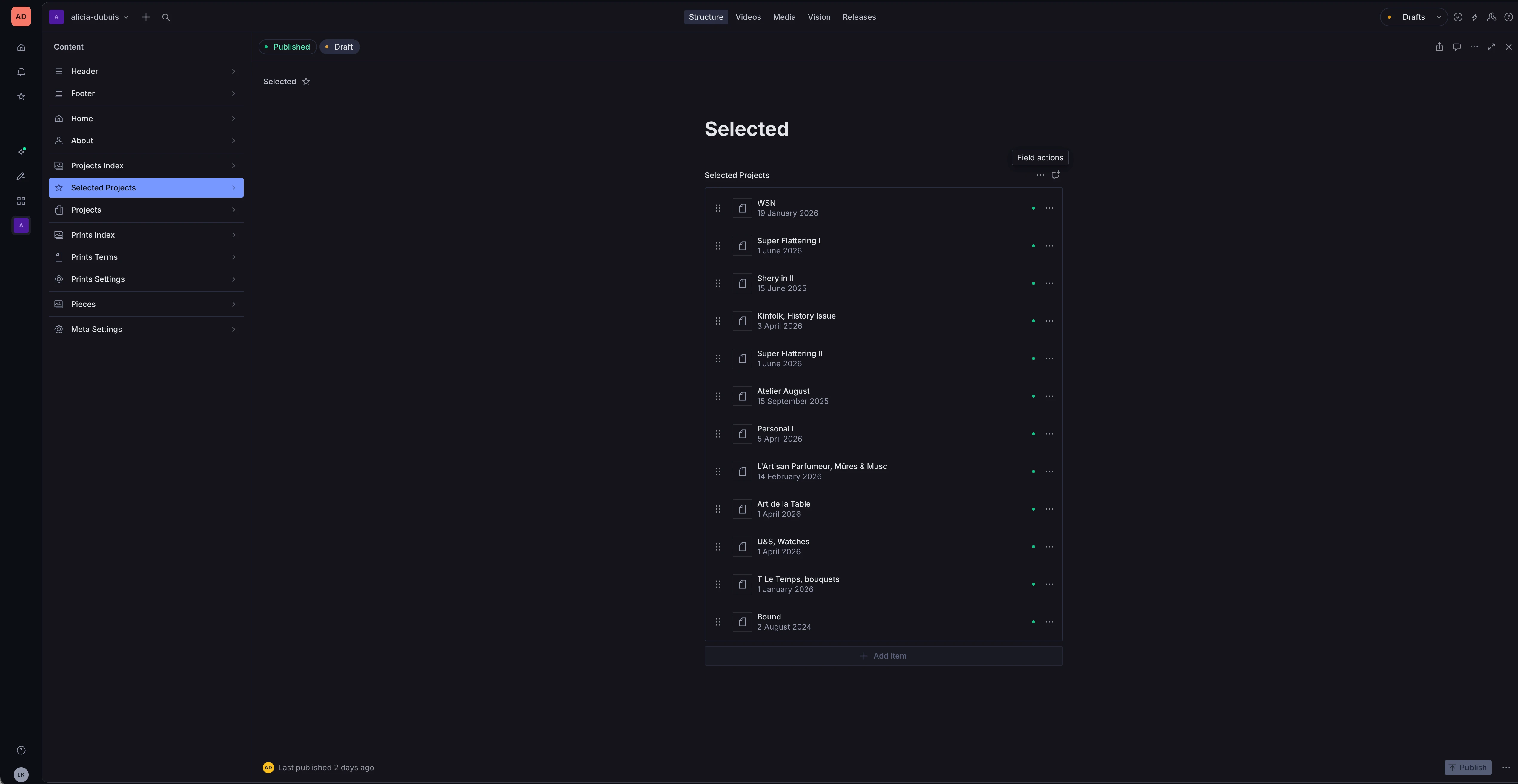
I started by building out the CMS. For this build I opted for a custom CMS structure using .
Alicia manages the whole website herself from the CMS studio, including; pieces, prints, navigation and text content.
Frontend
was the optimal choice here and the whole site is statically generated - which is ideal for performance, and SEO optimisation.
The code is minimal, clean and readable, with small components that are easy to maintain and update.
Typescript is used throughout, and there’s no CSS framework - just plain old CSS.
Images
Images are highly optimised using Sanity’s image pipeline, webp format, and lazy loading to ensure fast load times without sacrificing quality.
Video
Videos are hosted and streamed using which takes care of encoding and delivery, ensuring smooth playback across devices and network conditions.
Repo
The entire codebase lives in a single pnpm monorepo, clean, tidy and shared dependencies between the frontend and CMS.
Hosting
I always opt for self-hosting where possible.
This was a special case where Alicia wanted her production site hosted and manged on the ethical Swiss hosting platform .
This was achieved with a simple custom Github Action, which uses SSH to build and deploy the site static site files to Infomaniak’s servers.
Outcomes:
The site has only just been launched, so I’m waiting for the metrics to come in - but I can say that visually it is absolutely stunning - props not only to for the design, but also to Alicia herself for her incredible photography. The hosting is working smoothly, and Alicia is able to manage her own content and site updates with ease.